

Client (Hypothetical)
The Dragon
The Dragon
Deliverables
Brand Identity
Brand Identity
Reimagining the logo and branding of Guelph’s very own award-winning comic book store with a bold new look.
Rebranding Guelph's comic book store The Dragon is part of my weekly design series where I reimagine local brands in the city to push my creative boundaries while also promoting my brand and Guelph local businesses.
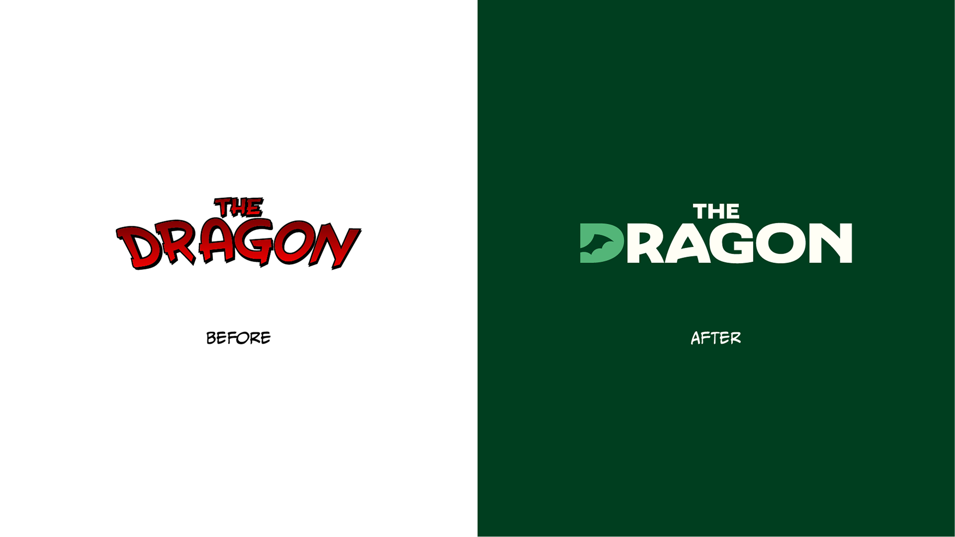
My goal for this project was to modernize the store's logo and provide it with personality and versatility that their current one is lacking. The project also aims to build them a visual identity that encapsulates the adventure, heroism, and magic that comic book stories often tell.
Distinct
To make the brand stand out from other comic book stores, I opted for typography that deviates from traditional comic fonts. Instead, I chose a bold and distinctive typeface that not only stands on its own but also complements the store's namesake.
To make the brand stand out from other comic book stores, I opted for typography that deviates from traditional comic fonts. Instead, I chose a bold and distinctive typeface that not only stands on its own but also complements the store's namesake.
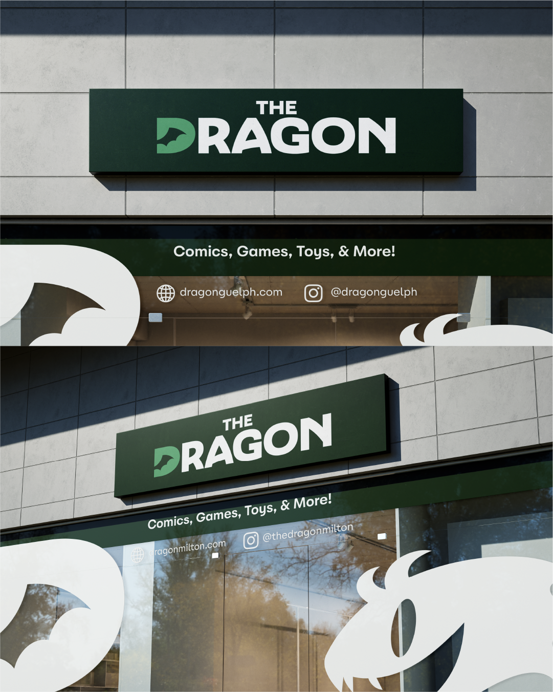
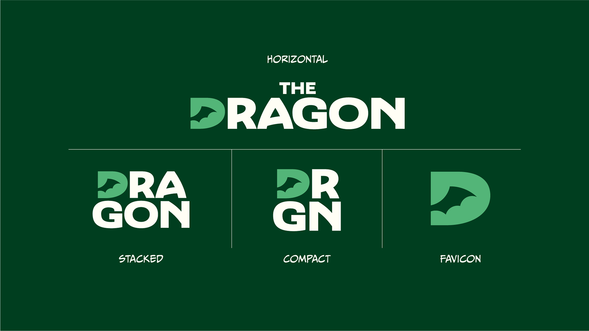
Beyond lacking a strong character, the store's logo also lacks the versatility needed for various applications. My iteration addresses this by offering multiple variations that adapt to different sizes and mediums.
Heroic
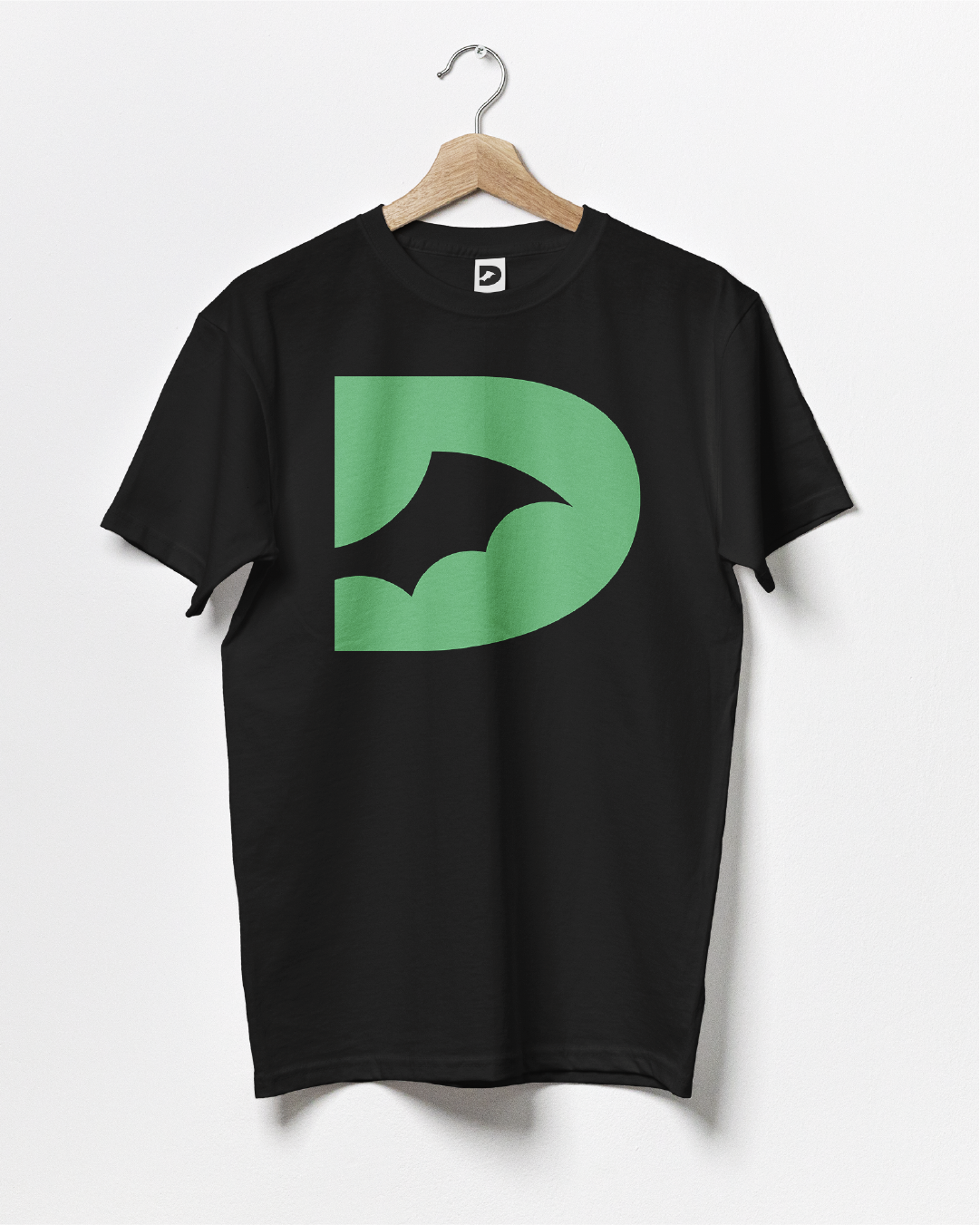
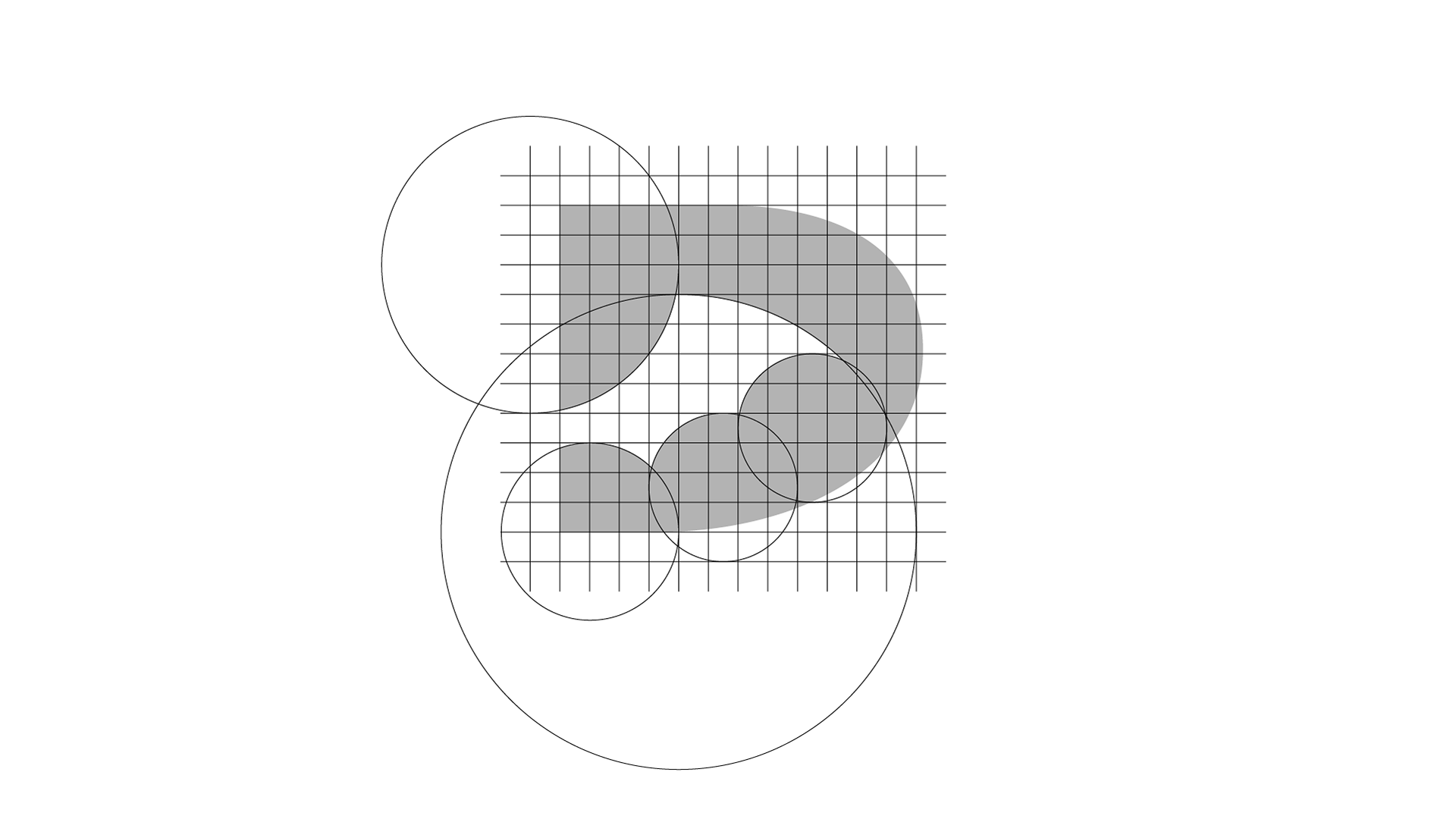
Instead of being cliche by using a dragon, I went for a more subtle approach by giving the letter 'D' a counter that resembles a dragon's wing. The emphasis on the first letter of the store's name draws inspiration from iconic superhero emblems such as Superman's letter 'S'.
Instead of being cliche by using a dragon, I went for a more subtle approach by giving the letter 'D' a counter that resembles a dragon's wing. The emphasis on the first letter of the store's name draws inspiration from iconic superhero emblems such as Superman's letter 'S'.
Mystical
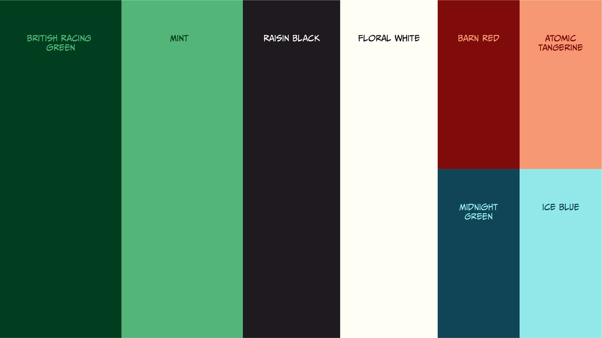
The Dragon also does not have a defined colour palette, using different colour variations across social media. The palette features classic green tones inspired by the dragon illustration on their storefront signages. The red and blue accents add a pop of energy and playfulness to the overall palette.
The Dragon also does not have a defined colour palette, using different colour variations across social media. The palette features classic green tones inspired by the dragon illustration on their storefront signages. The red and blue accents add a pop of energy and playfulness to the overall palette.