


Client
Guelph Storm Hockey Club
Guelph Storm Hockey Club
Deliverables
Brand Identity
Motion Graphic
Brand Identity
Motion Graphic
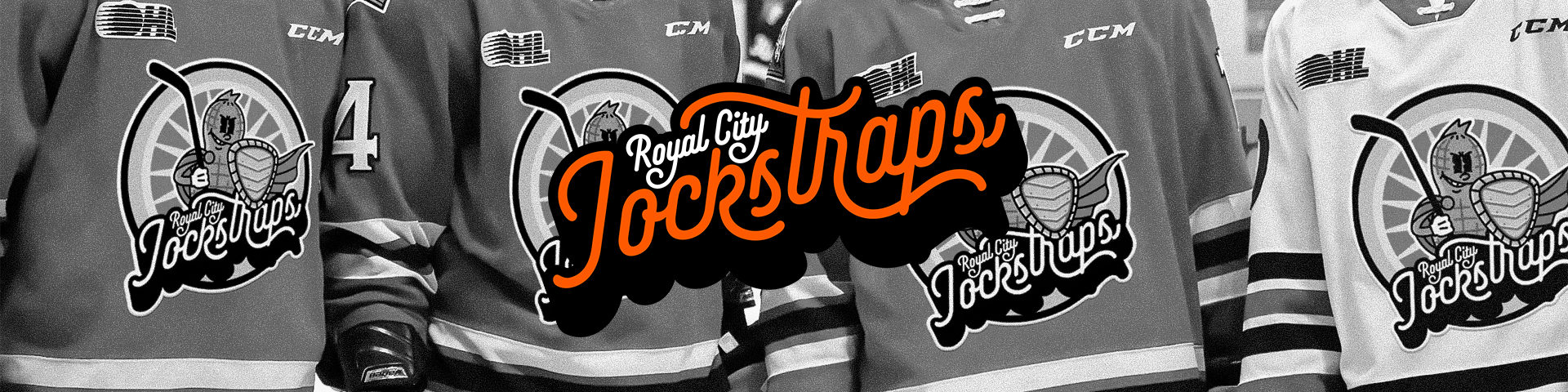
A humorous emblem for Guelph Storm's special week event rebrand that pays homage to the city's history.
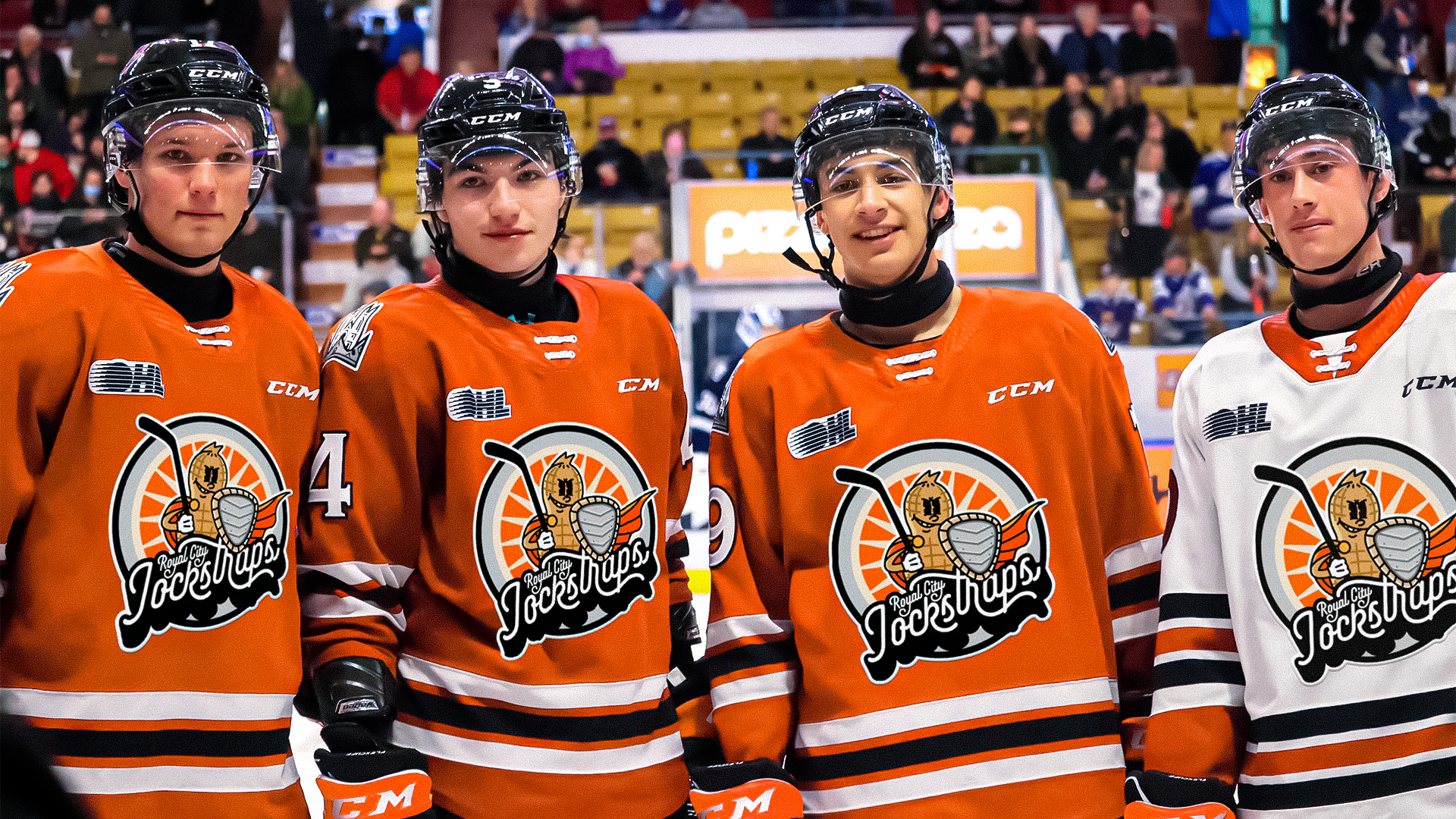
In collaboration with Hunter Sutherland, OHL's Guelph Storm Hockey Club approached me to help them conceptualize an emblem for a special event introducing the team's alternate name to their loyal fans. The objective was to craft a memorable icon that encapsulates the team's spirit and playful banter while paying homage to the city's rich heritage.
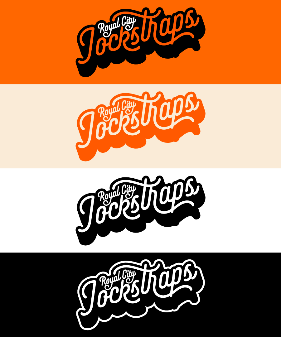
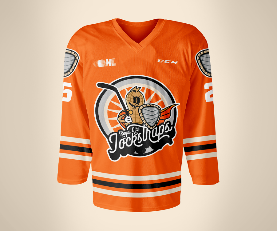
The logo was to be put on player jerseys as well as be used on their print and digital promotional materials, so it had be versatile. By breaking apart the elements of the main emblem, I formed a cohesive set of graphics that can be used in various sizes and media. The deliverables I provided were the emblem for the player jerseys, logo set for promotional materials, a motion graphic for the arena video display, as well as other auxiliary graphics.
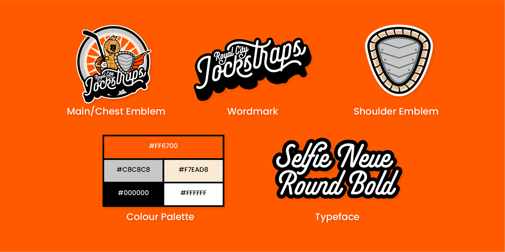
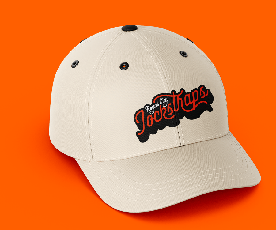
The name 'Royal City Jockstraps' pays homage to the invention by the Guelph Elastic Hosiery Company in 1927—a protective metal hard cup for jockstraps sold under the name 'Protex.' The name 'jockstrap' became a household term following a competition held to name the innovation.
Guelph Storm was inspired by the playful rebrand of The Raiders to The Cobra Chickens, and they wanted to have their own. Their goal was to create a lighthearted special event where fans and players could set aside the seriousness of hockey and simply have fun. They also requested cursive typography with rounded strokes, paired with an orange, black, and white colour scheme, mimicking the text and colours found on the packaging of 'Protex' products.
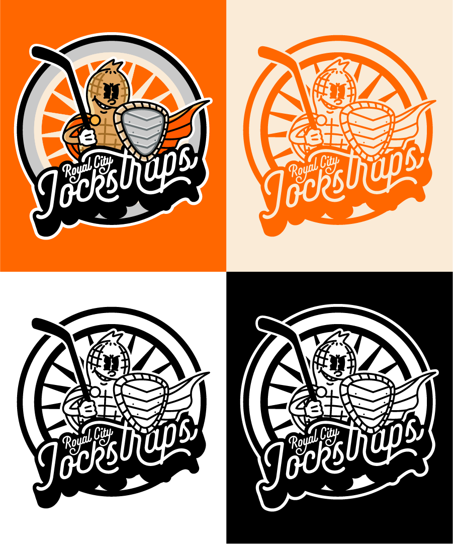
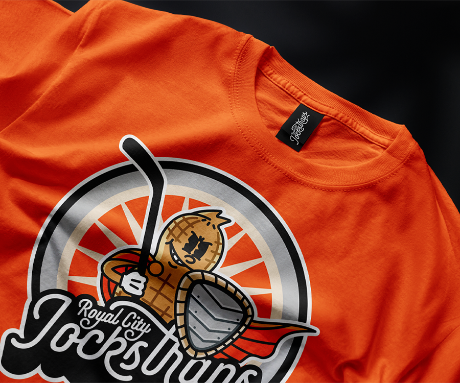
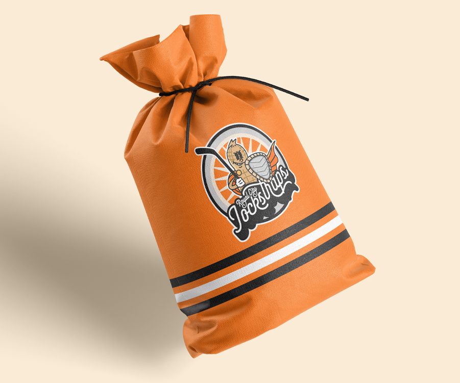
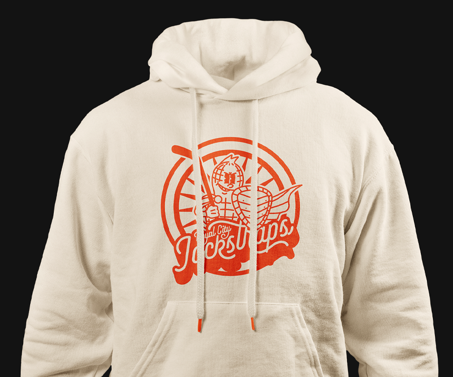
One of the challenges we faced when making the emblem was the integration of the hard cup into the design. I initially pushed for more minimalist approach, as I was inspired by iconic sports logos. I believed that a strong emblem should be simple, but the client insisted that we push the humour even further by adding a mascot or character to the design.
I presented multiple concepts to Guelph Storm, but we ultimately settled on a peanut character holding a jockstrap as a shield. It plays on the idea of how the jockstrap's main function is protect someone's "nuts". The outlandishness and the slight uncouth undertone behind the mascot is what the emblem needed. The art style of the character also help sell the vintage feel of the design, as it pays homage to 1920's cartoons, reflecting the era when Guelph Elastic Hosiery operated.
Guelph Storm also entrusted me with creating a team chant motion graphic for their arena screen. While they initially wanted me to replicate another team’s chant animation, I persuaded them to develop something unique that aligned with the Jockstraps' visual identity. This project also gave me the perfect opportunity to experiment with noise effects and 3D text animation for the first time.
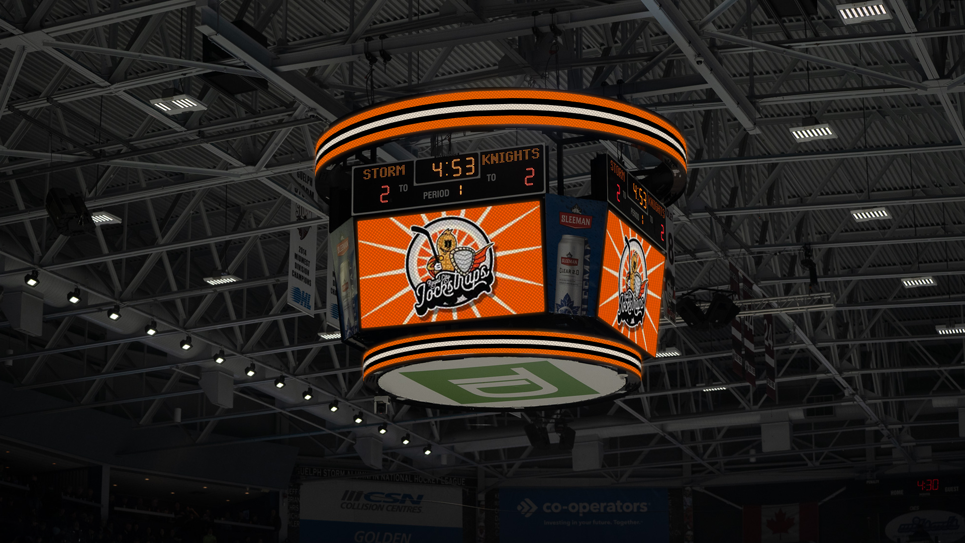
To enhance the animation, I incorporated film noise and chromatic aberration, adding a tasteful vintage aesthetic. The 3D text animation mirrored the emblem's typography, tying the visuals together seamlessly. As a final touch, I introduced subtle, random movements to the graphic elements, replicating the charming shakiness of films projected on vintage reels.
Working on this project was a truly enjoyable and rewarding experience. The client was so thrilled with the emblem that they went a step further, creating a mascot based on the character in the design. Fans across social media were also delighted and pleasantly surprised by Guelph Storm's bold and humorous new direction.

By the end of the project, I realized that stepping outside of my comfort zone and fully embracing the client’s creative vision can lead to something extraordinary. Collaborating in this way not only brought their ideas to life but also pushed me to explore new creative heights, resulting in a project that resonated with everyone involved.